WingScanner: Single Screen Rewrite
CHALLENGE:
Turn the designer’s copy into a well-written and well-designed screen that appears right before the user gets to the checkout
SOLUTION:
Simplify copy and make it more scannable for users

Background:
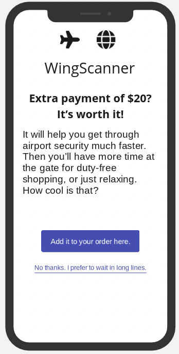
WingScanner is a low-cost airline with a new feature that allows customers to skip long lines when they pay an extra $20. However, the copy wasn’t easily scannable for users to quickly understand what they would be getting with this feature.
Thus, I worked as the sole UX writer to make the copy more engaging and easily digestible for users.
Before:
headline doesn’t communicate enough about the product
body copy isn’t scannable
CTA doesn’t connect back to the headline
alternate CTA shames user
After:
headline immediately gets to the main point of the feature
bullet points make body copy more scannable
CTA connects back to headline
alternate CTA copy is more neutral (rather than shaming users for not choosing the new feature)

Results:
This was an assignment for my UX certification course. However, if I’d had the opportunity to move forward with the assignment, I would have tested different versions of copy to see which version performed best with users and minimized user dropout.