Emerald Advance Loan: Reiterating a Landing Page
CHALLENGE:
Users are taking out loans but aren’t paying them back
SOLUTION:
Update the Emerald Advance Loan landing page to emphasize the repayment process of the loan rather than simply getting the money quickly
Background:
Emerald Advance Loan is an H&R Block financial product where users can qualify for a fixed-rate, short term loan up to $1,300. For the 2023 2024 season, H&R Block saw a record number of people take out loans; however, a substantial amount of users did not pay the loan back.
So, I worked with my design partner (Trevor Stark) to revamp the Emerald Advance Loan landing page for the 2025 season in order to make it more user-centric and educational.
Before:
After:
Take a look at the process (below) to see how we got here…
Initial questions:
1) Why did so many users default on their loan?
PMs let us know there were some technical errors that contributed to this issue, but we still felt we could (and should) do a better job of setting expectations for users.
2) What is the primary demographic for Emerald Advance Loan?
Female, 26-45, children under 18, works full time, makes less than $40,000
3) How can we make the page more educational?
Laying out the page
We didn’t change the layout too much from what was in production for the previous season. However, we did want each section to be more clearly defined. This led us to TWO thoughts:
The page needs to double as get-to-know-the-product for new users while also come-back-and-reference-me for users who already have a loan out
We should have a clickable table of contents (below) to make the page easier to navigate and find important information
Copy changes to the MARQUEE
BEFORE:
potentially misleading headline
lack of clarity around what the actual product is
copy feels a bit jargon-y
AFTER:
added “loan” to headline to help users quickly understand what the product is
more direct copy that tells users what Emerald Advance Loan is, rather than just the perks
replace jargon-y skinny banner with clickable table of contents
add “if approved” per legal requirements
Copy changes to HOW IT WORKS
BEFORE:
headline could potentially be shorter and work harder
step 2 isn’t clear
AFTER:
shorter headline that gets more to the point
added clarifying copy to step 2
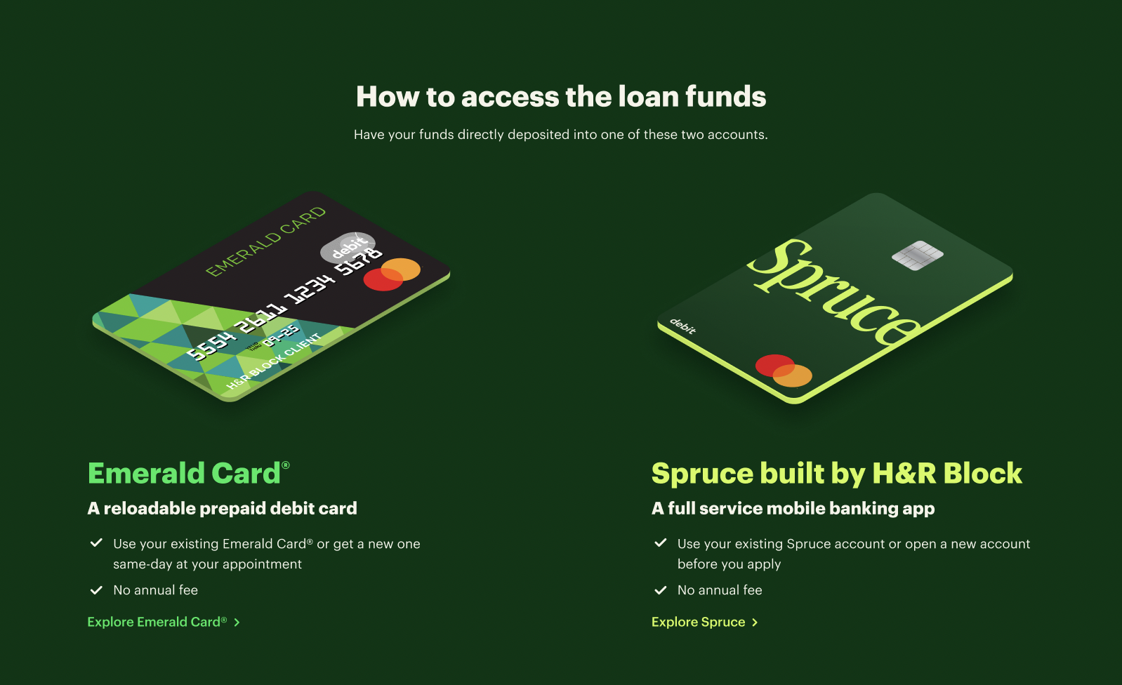
Copy changes to HOW TO ACCESS FUNDS
BEFORE:
“easy” is subjective and not helpful in this context
component h2 is more jargon-y than informative
product descriptions/h2s are long and unclear
AFTER:
shorter headline that gets more to the point
shorter component h2 that gets more to the point
shorter product descriptions/h2s that are more clear
Copy changes to FEES & REPAYMENT
BEFORE:
headline isn’t clear and direct
h2 is unnecessary
information isn't scannable
AFTER:
headline is more clear and direct
removed the h2
more scannable copy with separated information and bolded headlines
added in more context around interest (including an example)
Copy changes to MANAGING THE LOAN
BEFORE:
headline could be more scannable
AFTER:
headline is shorter and more direct
Results:
We’re still in the beginning of the 2024-2025 season, but we’ve already seen a 10% YOY increase in loan applications. And while we can’t point to one thing to credit this increase in applications, it’s helpful to know a more educational, user-friendly landing page is contributing to that success for the business.
Next steps:
We’ll continue to learn from user behavior and data for this season so that we can continue to reiterate and make the page even better.


