Clixflow: Creating a User-Friendly Data Collection Form
CHALLENGE:
Collect user data to help customize the product to the user’s intended use
SOLUTION:
Create a multi-page form (from scratch) that feels conversational and easy for users to complete

Background:
Clixflow is a website builder that allows users to build websites by dragging and dropping components (no coding required). However, there wasn’t a way to collect user’s data in order to customize the experience to each individual.
Thus, I worked as the sole UX writer to build a multi-page form that would gather more data from users in a way that feels easy and conversational.
The Solution:
A five-page form that lets users know why they’re answering questions, how long it will take, and an alternate path if they’d like to forego answering questions.


Take a look at my process (below) to see how I got here…
Initial Questions:
1) Can users opt out of answering questions?
I will assume users can opt out of answering individual questions as well as the entire survey to reduce friction if users just want to explore different layouts and themes without providing personal information
2) How is this data being utilized to help users when they’re using our website?
I know the data helps us provide users with a more customized experience (with layouts, features, etc.), but I’d love to see a specific example to better understand how this data changes and enhances their experience when using our website
3) How is this data being used by marketing? What information are they trying to get about our users?
4) Can users change their answers later/at anytime?
Research - Competitor Analysis
I started by looking at how other sites collect user data to customize each user’s experience.
EXAMPLE 1 - Squarespace

Noted Form Features:
buttons for SKIP, I’M JUST BROWSING, and BACK
header = question
subheader = explanation
Also, there is user feedback when they click on an answer:

Noted User Feedback Features:
bolded outline around answer when user selects it
FINISH button increases opacity and can be clicked once user selects an answer
EXAMPLE 2 - Webflow

Noted Form Features:
BACK button
header = question
subheader = why they’re asking / why collecting user data
4 blue dots at top of each page to track user progress
questions enclosed in a box
Also, there is user feedback when they click on an answer:

Noted User Feedback Features:
bolded outline around answer when user selects it
blue check mark next to user’s choice
text of user’s choice turns blue
CONTINUE button increases opacity, turns blue, and can be clicked once user selects an answer
EXAMPLE 3 - Wix

Noted Form Features:
SKIP button
header = question
search option
Also, there is user feedback when they click on an answer:

Noted User Feedback Features:
NEXT button increases opacity, turns blue, and can be clicked once user selects or types in an answer
Building Rough Drafts
I took the information and made some rough drafts for our own form. I started by building a general template I could use for all the pages.


I picked Draft 4 because:
it feels cleaner having the BACK and SKIP buttons at the top of the frame with arrows rather than having multiple buttons at the bottom with the CONTINUE button
having a radio button next to each option helps the user understand they need to choose an answer in order for the CONTINUE button to become accessible
having the box/text color change (in addition to the radio buttons) help give additional user feedback when they click the box
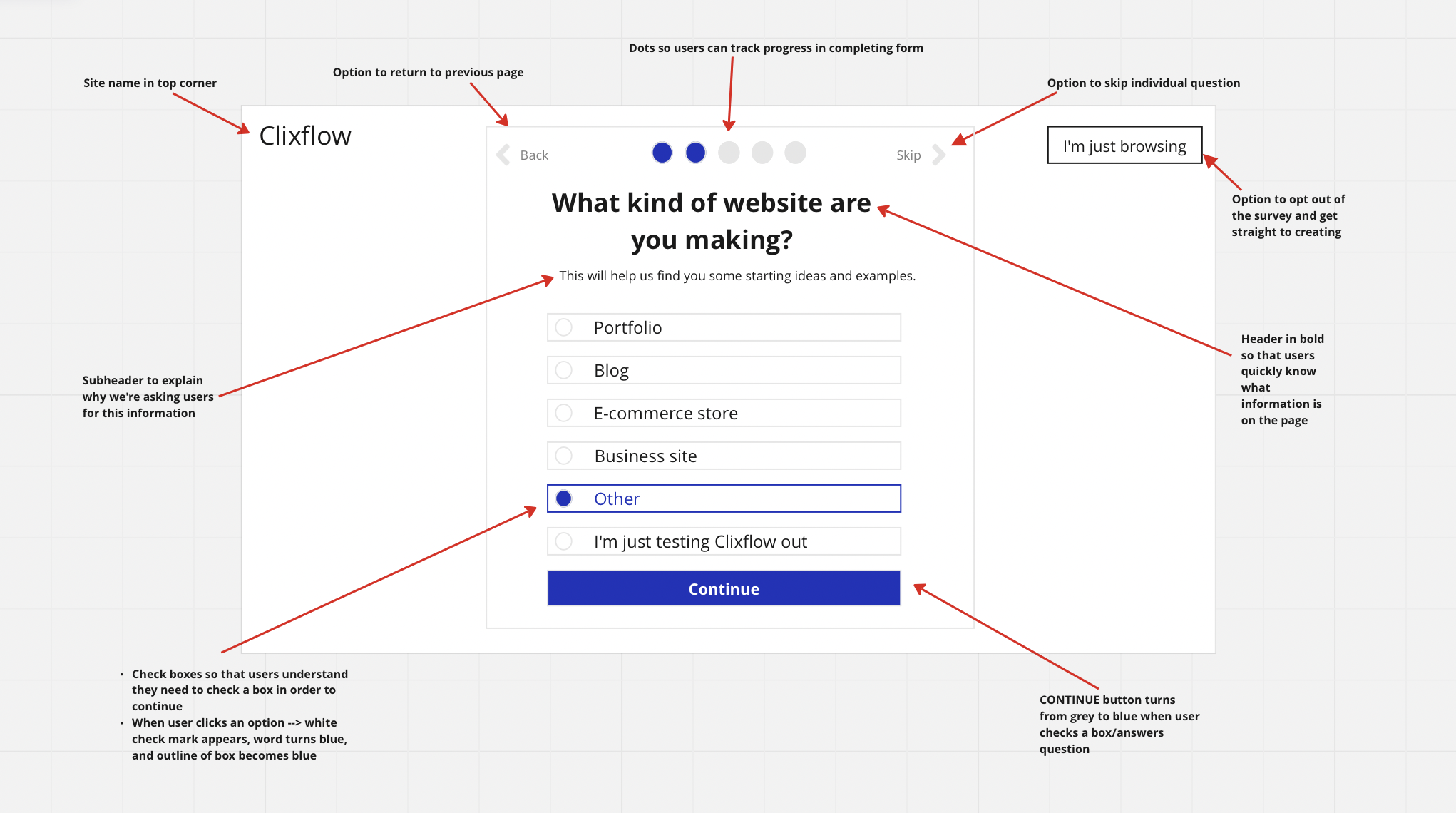
Establishing the Template
Here’s the final template I decided on for the form:
Adding a Page to the Beginning
I showed my rough drafts to a few of my peers. A recurring question I got was, “How will you encourage users to complete the form?”
I realized we would need more than just subheaders to explain to users why we’re collecting this data. We needed something to set the stage and help users understand why we’re asking them to give us their time and information rather than just sending them straight to building their website.
Thus, I decided to add a page at the very beginning to inform users:
they would be answering a few questions
it would be quick
it will help us personalize their Clixflow experience

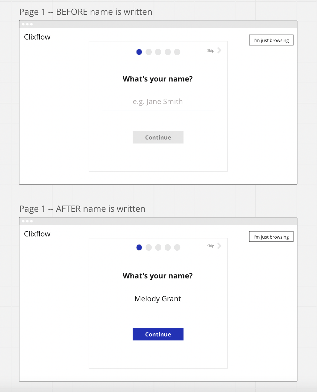
Page by Page - PAGE 1
Page 1 = What does the user want to be called?
Other headline options I considered:
“What is your preferred name?”
“What should we call you?”
“How should we greet you?”
Ultimately, “What is your name?” felt the most direct, friendly, and conversational.
Page by Page - PAGE 2
Page 2 = What kind of website is the user making?

Other headline options I considered:
“What kind of website are you building?”
“What kind of website are you creating?”
Ultimately, “What kind of website are you making?” felt the most direct, friendly, and conversational.
Page by Page - PAGE 3
Page 3 = What is the user’s role?

Subheader vs. No Subheader - I initially planned to use a subheader on each page to explain to users why we’re asking that specific question. However, after adding the first page (explaining we’re collecting this data to help personalize their experience), it felt redundant to add a subheader for this question.
Page by Page - PAGE 4
PAGE 4 = Who is the user building the site for?

Other headline options I considered:
“Who are you building the website for?”
“Who are you building a website for?”
Page by Page - PAGE 5
Page 5 = How familiar is the user with building websites?

Other headline options I considered:
“Have you built websites before?”
“Have you made websites before?”
“How familiar are you with building websites?”
“How familiar are you with creating websites?”
“How comfortable are you with creating websites?”
Putting it All Together
Here are the final drafts all together:


Next Steps:
This was a class project, so I wasn’t able to test it with real users. However, my next step would be getting feedback across departments (other Content Designers, the UX Design team, Product, Development, Legal, and any additional Stakeholders) and making revisions.
Then, would be usability testing (both qualitative and quantitative), analyzing any available data (number of users completing the entire form, percentage of users finishing/clicking through the entire form versus clicking on “I’m just browsing” CTA or closing out all together, number of users who finish building their website after completing the form versus not completing the form, etc.), and user research (interviews and surveys) to get more information on how users feel the form changes (or doesn’t change) their experience using Clixflow.
And of course the iterative design process is never-ending, so I would repeat some (or all) of these steps to continue to improve the copy and ultimately improve the user’s experience.